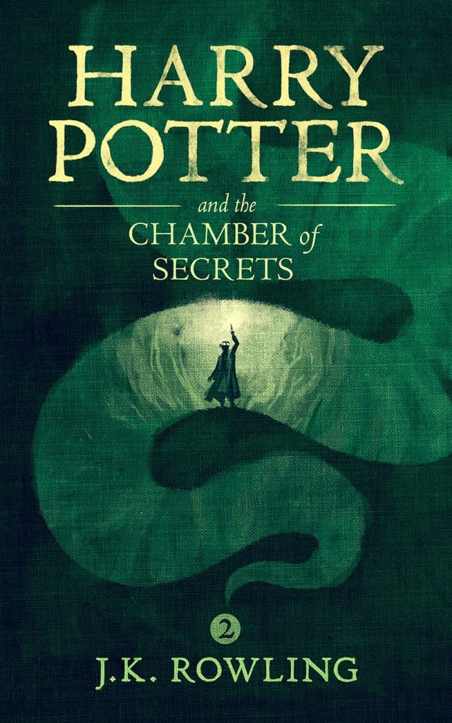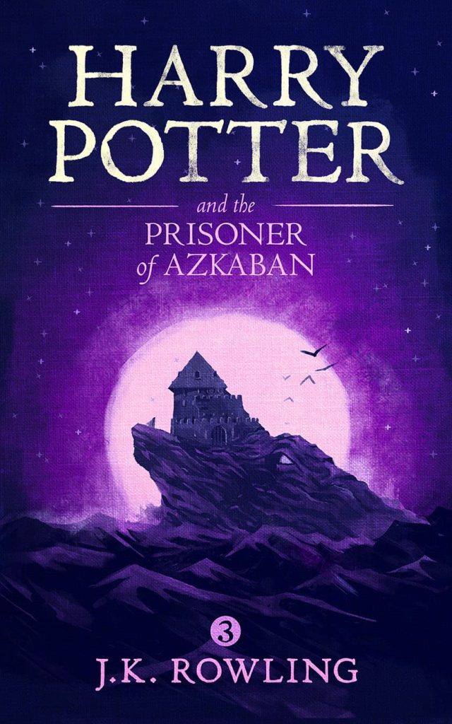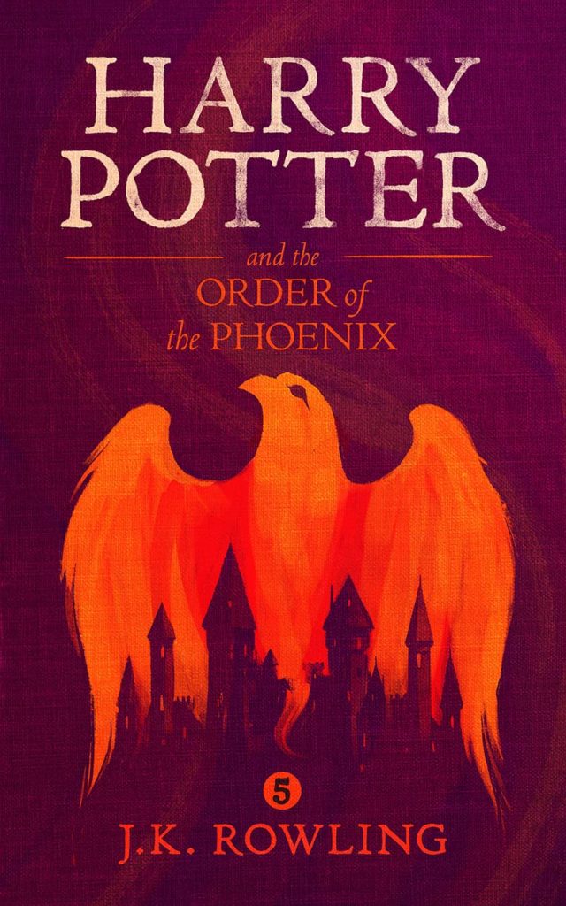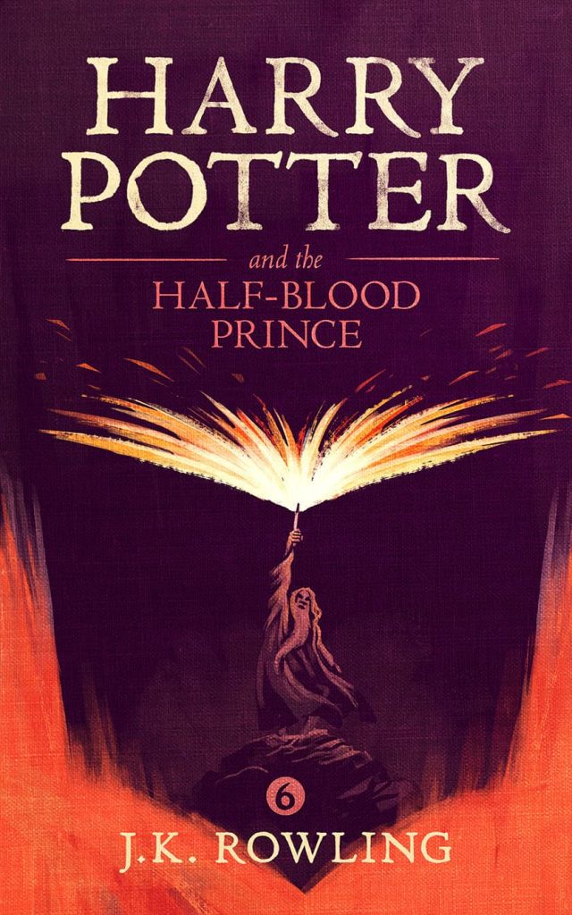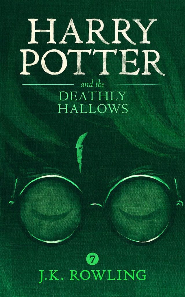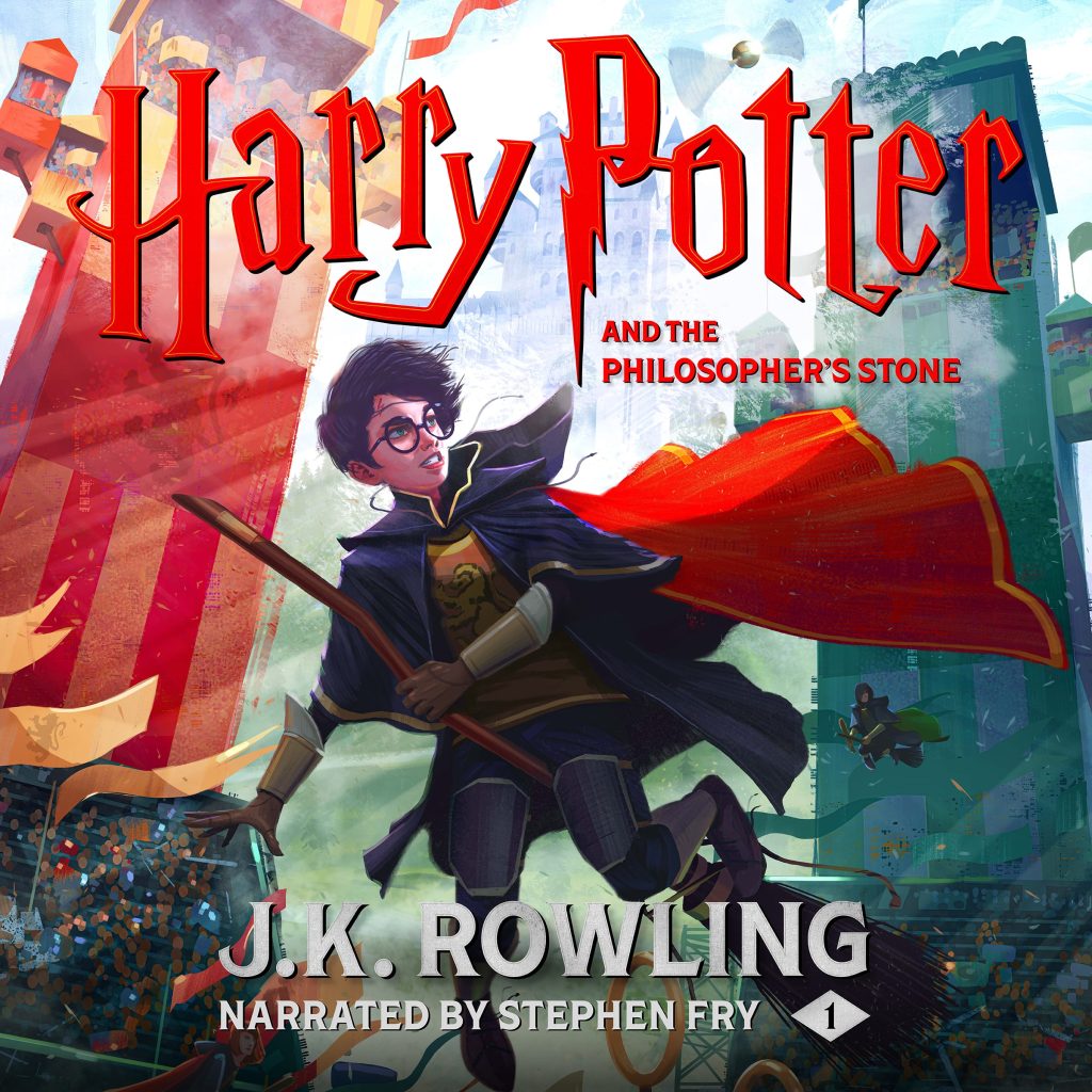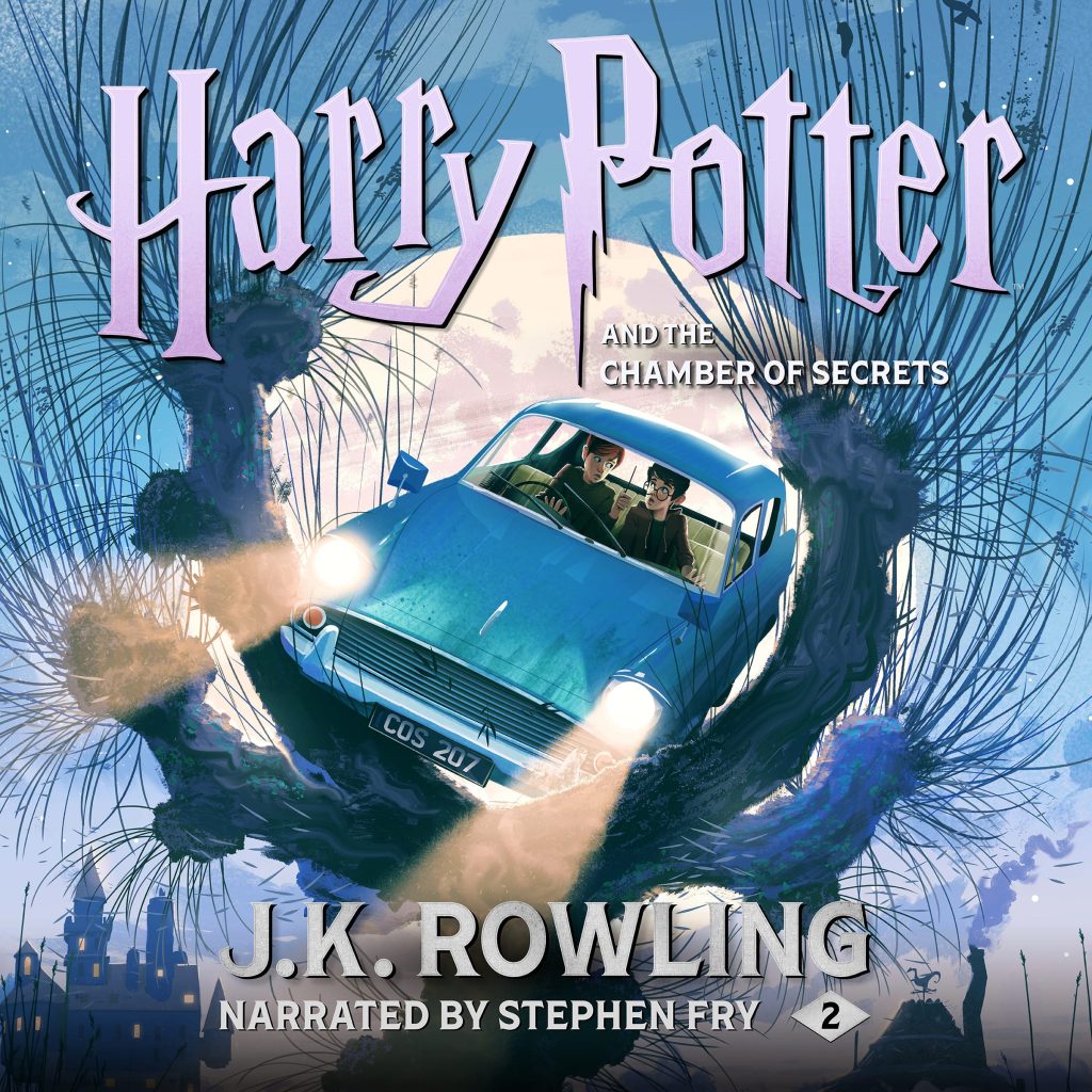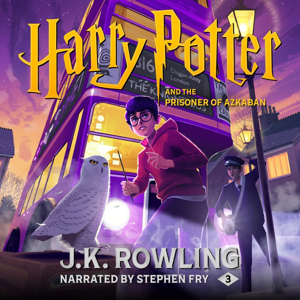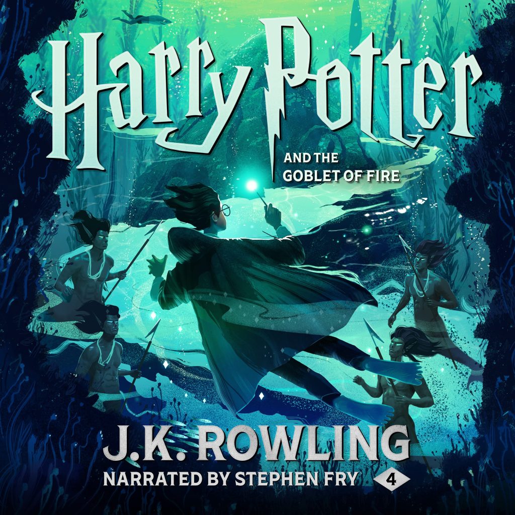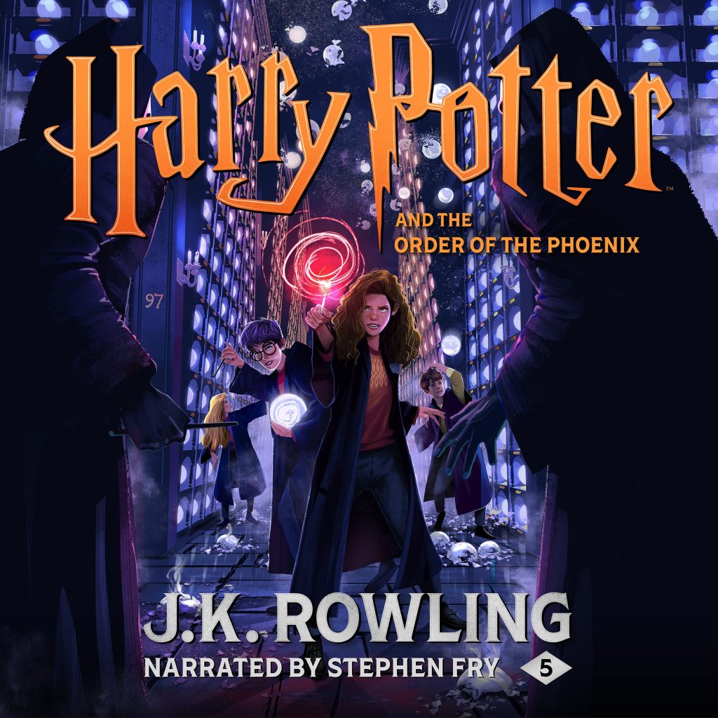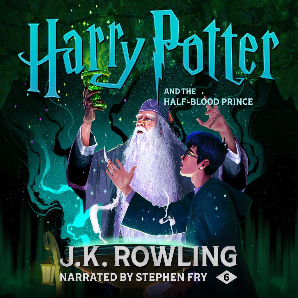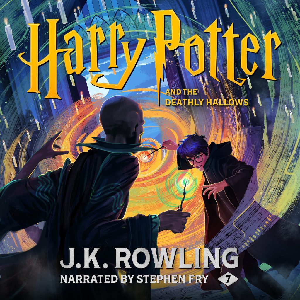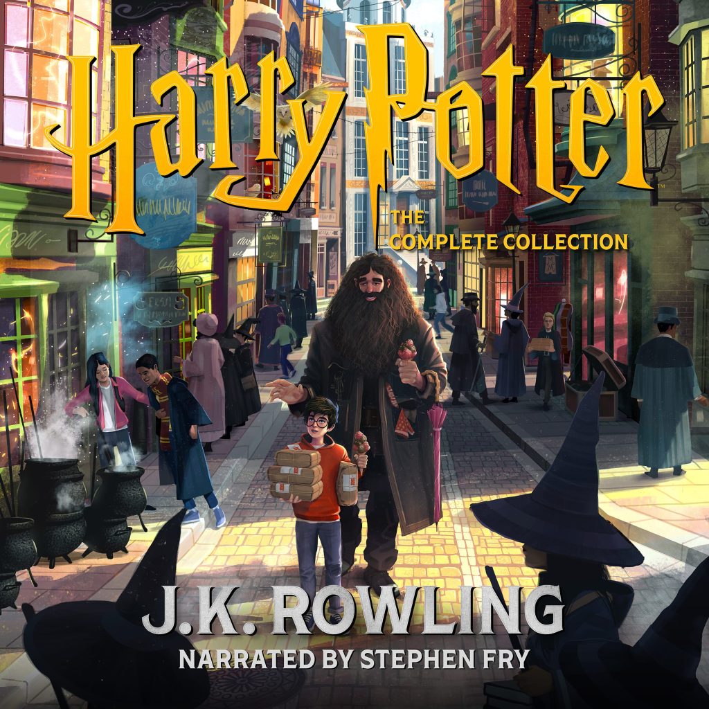
From 2015 to 2022, Pottermore Publishing’s digital identity was defined by a set of stunning covers commissioned from talented graphic designer Olly Moss.
Each of Moss’s distinctive designs cleverly told more than one story; readers and listeners were captivated by the unruly face of Voldemort emerging from Harry’s scar in the iconic Deathly Hallows cover or could see the silhouette of Hogwarts rising from the red phoenix featured on the design for Order of the Phoenix.
The level of detail and imagination behind each image proudly served the digital editions of The Boy Who Lived for six years. However, as 2022 approached – a landmark moment marking ten years since the foundation of Pottermore Publishing and the twenty-fifth anniversary of Harry Potter and the Philosopher’s Stone – we decided it was time to give our cover art a fresh look.
But where do you even begin when creating a new digital identity for a global franchise? Working in tandem with creative design experts Studio La Plage (SLP), this project began by exploring in-depth audience insights to uncover the core emotional themes that fans recognise at the heart of these beloved stories.
The aim was to give a renewed but instantly recognisable visual treatment while responding to the unique design challenges of Pottermore being a global, multi-language and digital-only publisher. The designs needed to immediately resonate at a small scale across a whole range of digital devices as well as title information translated into the twenty-six languages we publish in.
The extraordinary artwork brings scenes from the stories to life that have never featured in a Harry Potter cover design before, such as Harry during his first ever Quidditch match or the depths of the Great Lake during the Tri-Wizard Tournament. The details for each image were carefully extracted from passages throughout the seven books, creating beautiful and canonically accurate finished artwork.
Why not listen to how this detail was captured for yourself
A cluster of crude stone dwelling stained with algae loomed suddenly out of the gloom on all sides. Here and there at the dark windows, Harry saw faces… faces that bore no resemblance at all to the painting of the mermaid in the Prefects’ bathroom…
The merpeople had greyish skins and long, wild, dark green hair. Their eyes were yellow, as were their broken teeth, and they wore thick ropes of pebbles around their necks. They leered at Harry as he swam past; one or two of them emerged from their caves to watch him better, their powerful, silver fishtails beating the water, spears clutched in their hands.
Harry Potter and the Goblet of Fire, Chapter 26, The Second Task
A second later, a gigantic pair of wheels and headlights had screeched to a halt exactly where Harry had just been lying. They belonged, as Harry saw when he raised his head, to a triple-decker, violently purple bus, which had appeared out of thing air. Gold lettering over the windscreen spelled The Knight Bus.
For a split second, Harry wondered if he had been knocked silly by his fall. Then a conductor in a purple uniform leapt out of the bus and began to speak loudly to the night.
‘Welcome to the Knight Bus, emergency transport for the stranded witch or wizard. Just stick out your wand hand, step onboard and we can take you anywhere you want to go.’
Harry Potter and the Prisoner of Azkaban, Chapter 3, The Knight Bus
‘This modern take also captures a whole host of scenes that have never been featured on the covers before.’
Amy Houston, Senior Reporter
The Drum

You can also delve deeper into the artistic process and hear from those who worked closest to the project in a roundtable video aptly named ‘Uncovering the Magic’, available on Wizarding World’s YouTube Channel.
The team also created a suite of marketing assets based on the new designs. From character illustrations to atmospheric backgrounds and fonts, our harmonious marketing artwork can now be spotted all over the globe.
We are thrilled with how fresh and vibrant the new designs are and we are proud to have them on the front of our products, inviting readers and listeners to immerse themselves into a world that is full of love, friendship, bravery and, of course, magic!
‘It was both a challenge and an honour to take the legacy of the Harry Potter covers and create a new visual approach fit for the digital action…
Jack Bedford, Associate Creative Director
Our new covers celebrate the moment before the action. They invite readers to experience moments of fantasy, emotion, bravery and friendship’
Studio La Plage


